The organization
Fair Trade USA is the leading third-party certifier of Fair Trade products in the United States. Through their certification process, Fair Trade USA empowers consumers to use their spending to support sustainable, community-enriching products and practices, and it helps those communities to promote empowerment, income sustainability, community and individual wellbeing, and environmental stewardship.
The challenge
In many ways, data is core to what Fair Trade does. Fair Trade tracks commodities throughout supply chains, capturing product ingredients and following data from source to shelf. Making sense of this much data is difficult, especially when it remains trapped in spreadsheets and CRM systems.
Internally, Fair Trade teams want to use the data to illuminate the connections across nodes in the supply chain, and to more easily identify where gaps exist that need to be filled. For external customers and partners, Fair Trade also wants to increase the transparency of their sourcing and the visibility of the sustainable practices they support.
The approach
Making data useful means bringing it out of tables and into the hands of users where they can react to insights, identify opportunities, and spot gaps. DrivenData worked with Fair Trade USA to create a “supply chain map” with interactive visualizations of how products were assembled, in space and time, from their origins to their retail destinations.
This effort was focused on prototype map interface for the coffee supply chain. Coffee is a product where customers are highly interested in transparency, and, as a prominent product in the Fair Trade portfolio, it is a supply chain that has a wealth of inter-connected data. There were three goals of the project:
- Pressure test and highlight uses of the data systems that Fair Trade uses for understanding supply chains
- Evaluate both off-the-shelf and custom options for visualizing and communicating data insights for the organization through different BI tools
- Build a prototype supply chain map for coffee, creating back-end data pipelines and a clean, interactive dashboard displaying the most relevant information for users
The results
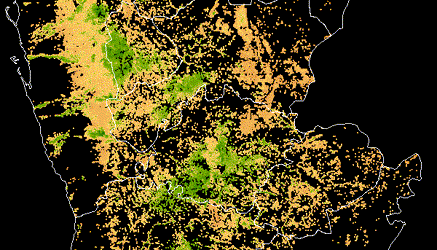
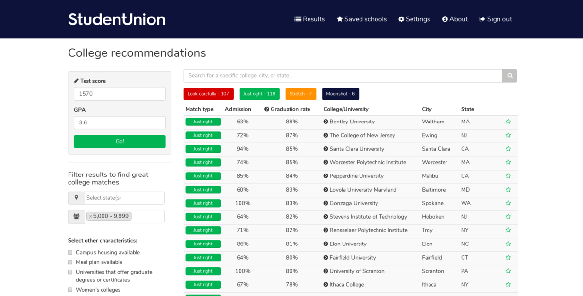
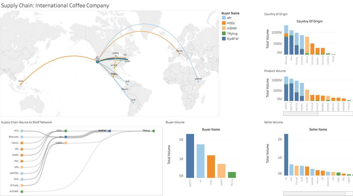
The final supply chain map that DrivenData built in early 2017 visualized end-to-end coffee supply chains through a simple, interactive dashboard. The proof-of-concept included a featured map displaying waypoints along the supply chain and connecting lines representing the directed flow of goods, as well as graphs of contributing buyers, sellers, products, and locations.
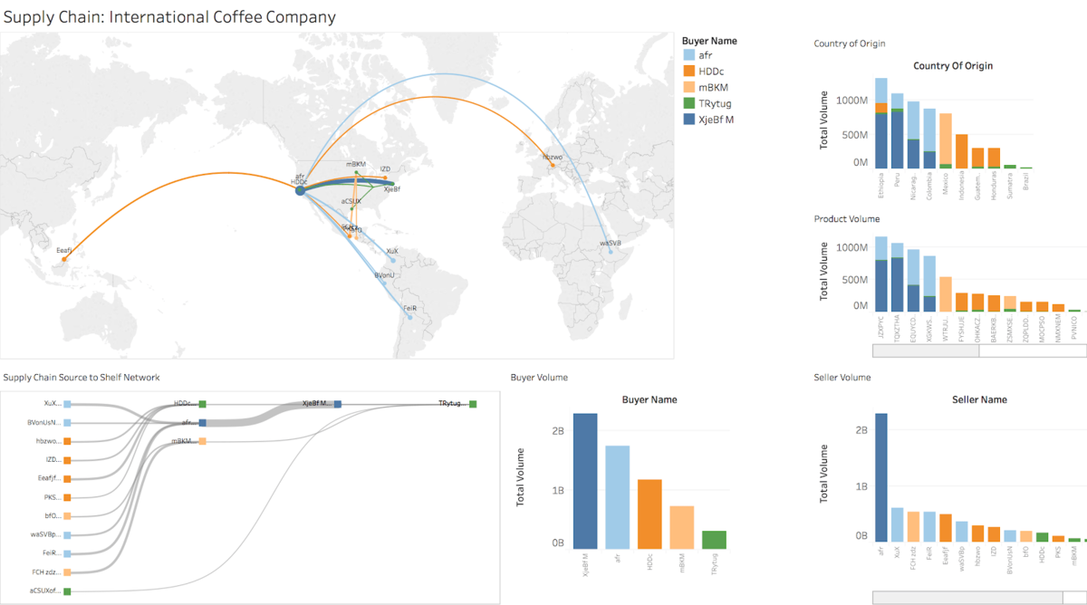 Screenshot of interactive supply chain map, anonymized for sharing, where custom back-end data pipelines are connected with online analytics and visualization through Tableau.
Moreover, the project resulted in assessment of Fair Trade’s data model and BI approach that laid the groundwork for leveling up the organization’s use of data in how it delivers and communicates impact. Bennett Wetch, VP of Technology Innovation, describes the effect of this first project:
DrivenData helped us clearly communicate the opportunities and room for improvement in our data model. This partnership was instrumental in gaining the support necessary to create a data team at Fair Trade USA. As a direct result of DrivenData’s work, Fair Trade USA has leaned in to data science and visualization in order to better communicate the socioeconomic and environmental impact of millions of purchases of Fair Trade Certified products around the globe.
— Bennett Wetch, VP of Technology Innovation
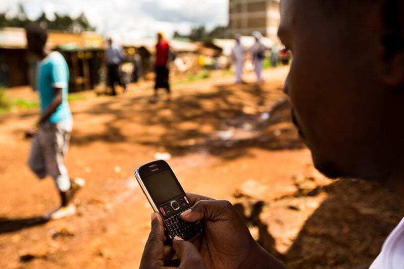
Photo credit: James Rodriguez for Fair Trade USA, via the Fair Trade USA Photo Library.