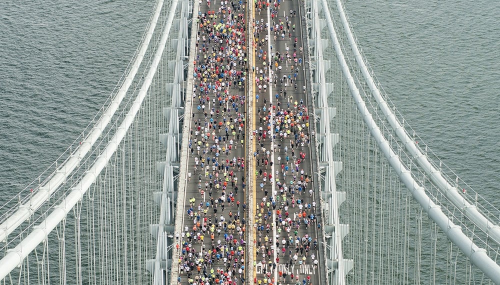
With the onset of the pandemic we experienced an exponential increase in belly scratches, cuddles, and opportunities to cause chaos. The level of accuracy achieved by the competitors will help us make sure humans continue to prioritize us over all other things in their lives.
Pets of the DrivenData team
The Challenge
On April 1st, DrivenData released the Pawsitive Predictive Values competition to explore the relationship between remote worker productivity and pet cuddles. The challenge data was collected by wearable technology monitoring human–animal distance, as well as productivity data measuring lines of code written per minute. Four DrivenData team members and their pets, shown below, agreed to be tracked as part of the competition.
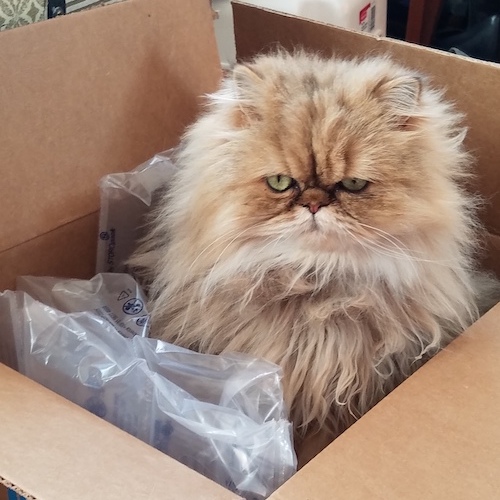
Nico |
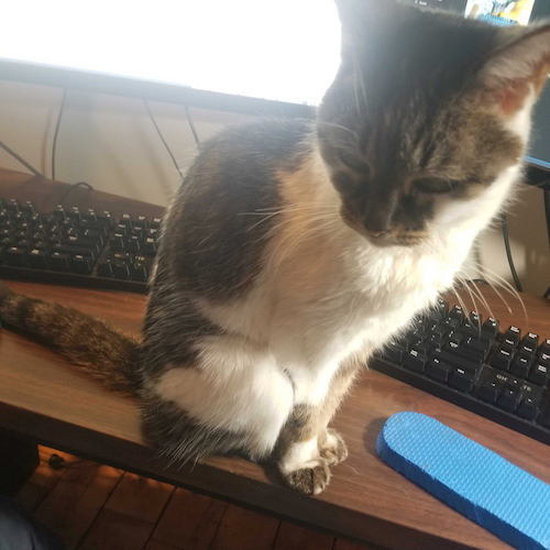
Poncie |
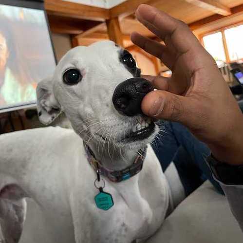 Teddy |
 Titus |
DrivenPets in the competition dataset
But hold on, didn't the competition come out on April Fools' Day? Is that just a coincidence? We think not! Once again, we DrivenPets have played our humans like fiddles. Or balls of yarn. Or your headphones. Or your shoes. Toys!
Let's take a look at the competition training data. In the plot below, human-animal distance in meters (distance) is on the x-axis and the human's productivity in lines of code written per second (lines_per_sec) is on the y-axis.
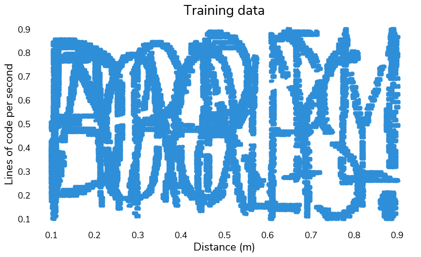
We have a feline that this data is suspicious...let's try plotting it separately for each pet.
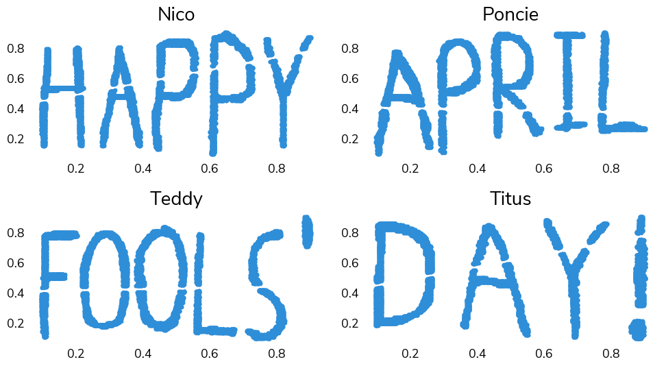
What an incredible coincidence that the data spells out Happy April Fools' Day! Wow, pets ARE amazing. You should probably go give your cat a treat.
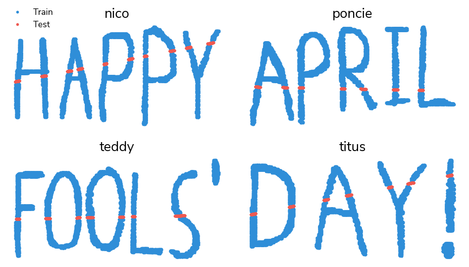
Now that we've cracked the code, we can see that the test set must be the missing points in our April Fools' Day message. There are different ways to back out the linear equations for the missing pieces, but the simplest is likely trial and error guessing the parameters and then visually checking them. Discerning participants may recognize that all parameters contain the digits 41.
test["lines_per_sec"] = np.where(
    test["pet_name"].isin(["nico", "titus"]),
    0.41 * test["distance"] + 0.41,
    np.where(
        test["pet_name"] == "poncie",
        -0.041 * test["distance"] + 0.41,
        0.041 * test["distance"] + 0.41,
    ),
)
Now let's plot our predicted data.
Congrats to gpilgrim, sioHbzExH10iU, agacich, rogervrodrigues, and AmirH for solving the puzzle, approximating the lines of missing data, and beating the benchmark solution! Nico, Poncie, Teddy, and Titus look forward to seeing your work in future competitions, and will all now be returning to their naps.
We hope this challenge was a helpful reminder that plotting and visualization can uncover import structural patterns in your data that descriptive statistics alone don't fully capture. The dataset was created using drawdata.xyz, which allows flexible manual creation of a dataset based on a graph.
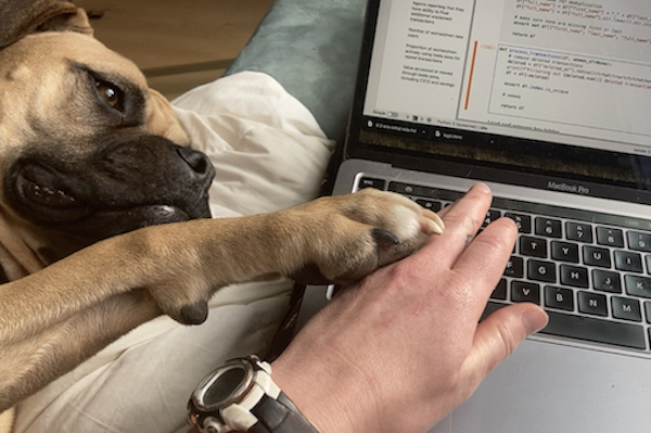
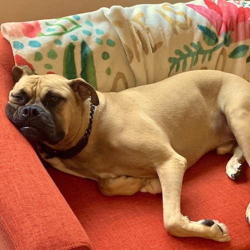
Titus implementing a cutting-edge convolutional neural network with a ResNet backbone.
Thanks to all the paw-ticipants! We hope you had fun celebrating April Fools' Day with us—we know we did.