by
Katie Wetstone
NASA's commitment to open data sharing empowers global efforts to tackle urgent issues, such as the Sustainable Development Goals. It’s exciting to see the innovative solutions being proposed by these diverse teams from around the world.
Dr. Steve Crawford, Senior Program Executive for Scientific Data and Computing at NASA
Background
Our world is facing many urgent challenges, such as climate change, water insecurity, and food insecurity. Maintaining and improving quality of life around the world requires bringing together innovators across disciplines and countries to find creative solutions.
One critical tool for understanding and improving the urgent challenges facing our world is Earth observation (EO) data, meaning data that is gathered in outer space about life here on Earth! Earth observation data provides accurate and free information on our atmosphere, oceans, ecosystems, land cover, and built environment. In this challenge, participants created visualizations using Earth observation data that advance the Sustainable Development Goals of zero hunger, clean water, and climate action.
The Pale Blue Dot: Visualization Challenge was designed enable a broader, more diverse audience to engage with Earth observation data.
Results
Through the challenge, a whole new community of solvers learned the tools they need to go forth and use cool satellite imagery! Almost 1,600 participants registered for the challenge, 70% of whom had never worked with Earth observation data before. Participants came from all around the world, representing over 100 different countries. Throughout the competition we received more than 130 submissions.
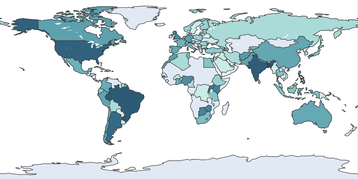
To get participants started, we published a blog post outlining some commonly used open Earth observation datasets. Participants went way above and beyond this starter resource, and incorporated over 50 different datasets into their submissions! These data sources spanned an impressive range of topics and formats. The most popular sources by far were Landsat and MODIS, two large-scale satellite imagery missions. Water movement from GRACE and trace gas measurements from AIRS also featured in many submissions.
Combining large-scale Earth observation data with other data types enabled many participants to better understand specific issues or locales. For example, honorable mention winner Data Science Nigeria combined satellite imagery with reports of violent incidents from ACLED to better identify areas at high risk of hunger. Smaller-scale, geographically specific datasets were also critical to a number of visualizations. These included country-wide datasets, like electricity interruptions tracked by Brazil's National Electric Energy Agency, as well as more regional information, like algal bloom sampling from Nebraska's Department of Environment and Energy.
Compared to the range of datasets, the tools used were not quite as varied. Most submissions utilized popular Python libraries like geopandas, rasterio, xarray, and matplotlib. QGIS, Microsoft's Power BI, Tableau, and Jupyter notebooks also facilitated many interesting visualizations, particularly for solvers with less programming experience. Many participants used beginner-friendly online interfaces, like NASA Worldview and Giovanni, to explore and manipulate data.
The Best Overall winners' full submissions are available in an open-source Github repository for anyone to learn from. To see more submissions, check out the gallery of Honorable Mentions for Compelling Visuals!
Meet the winners
Best Overall Prize
Five teams will have the opportunity to attend a 10-day Space Study program with travel, lodging, and tuition covered.
Community Code Bonus Prize
Katso Obotsang (username Katso) won the Community Code Bonus Prize for the post "Creating a visualization from your csv file in Python". Katso is based in Kweneng District, Botswana.
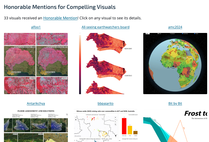
Honorable Mentions for Compelling Visuals
33 submissions received an Honorable Mention for Compelling Visuals. Check out the Honorable Mentions gallery page to see all of their visuals!
EE Frogs
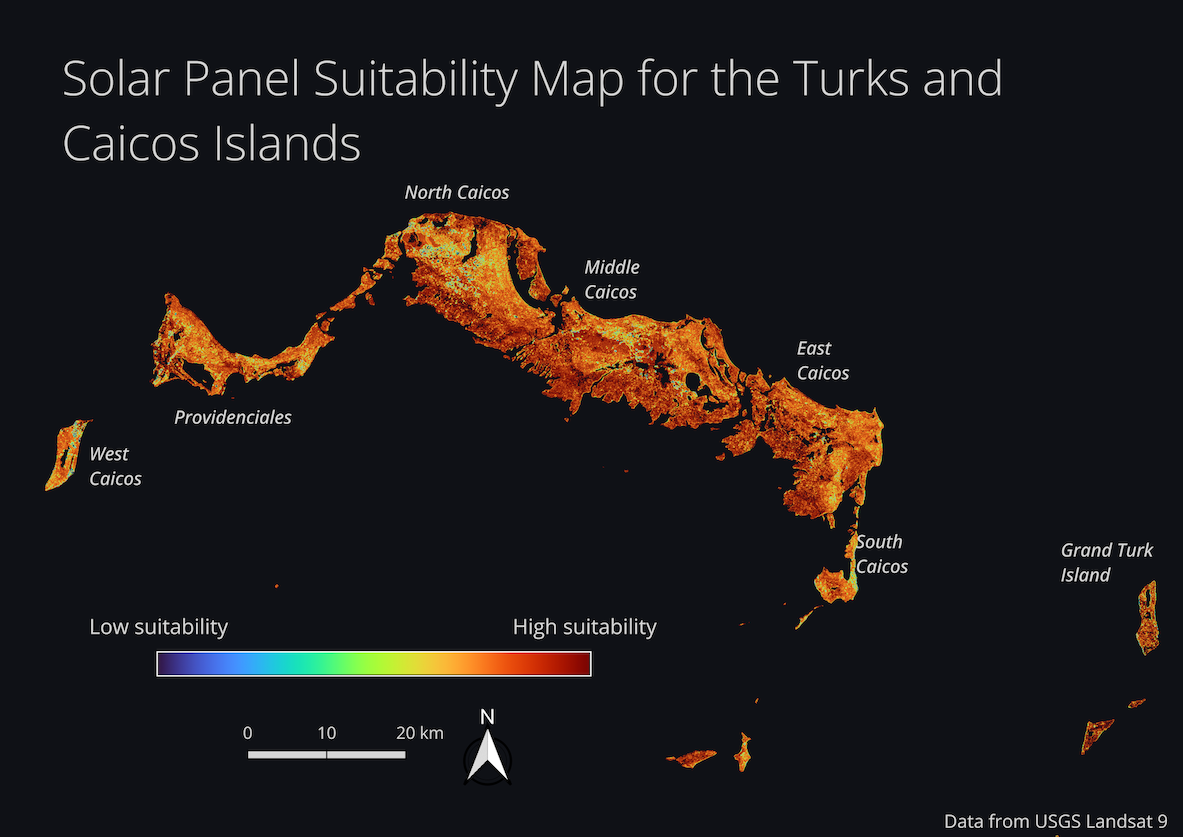
Project: Solar panel suitability on the Turks and Caicos Islands (SDG 13: Climate Action)
Team members


| Name | Username | Hometown | Social handle or URL |
| Alice Ni | aln26 | New York City, New York, USA | |
| Sebastián Sánchez Bernal | Bastian6 | Mexico City, Mexico | |
| Trenton Mulick | tmulick | Las Vegas, Nevada, USA |
Background
Alice is a senior at Boston University pursuing a BA and MS degree focused on geospatial sciences and remote sensing. Her interests lie in using technology and data analysis to understand and model dynamic natural processes and climate change. She is currently working on a project called visualizingEnergy, where the goal is to present data stories to inform and guide an equitable energy transition.
Sebastián Sánchez Bernal is studying Remote Sensing and Geospatial Sciences at Boston University. Born and raised in Mexico, he built a strong foundation in Physics Engineering at Tecnologico de Monterrey. Sebastián is the CEO and Co-Founder of WARPDOC INC., an initiative that seeks to simplify the code documentation process for software developers by utilizing machine learning for automation.
Trenton is currently a student at Boston University pursuing a master’s degree in Remote Sensing and Geospatial Sciences. He focuses on learning how satellites collect remote sensing imagery and how to apply those images to studying the global environment. In his free time he can be found hiking and rock climbing around New England.
What motivated you to choose this topic?
We chose to focus on the Turks and Caicos Islands because two of our team members have spent time living there studying marine science and saw firsthand how difficult energy generation currently is in some parts of the territory and how the people living there are impacted.
High level summary of your approach
To determine solar panel suitability, we used data on surface temperature, elevation, slope, and the normalized difference vegetation index (NDVI). Surface temperature, elevation, and slope all affect either the efficiency of solar panel energy generation or the ease with which solar panels can be installed. NDVI is used as an estimate of vegetation cover.
These islands have climatically important ecosystems such as mangrove forests, which sequester high amounts of carbon and provide other critical ecosystem services such as shoreline protection. We determined that a higher NDVI value indicating higher vegetation cover should lower the suitability score in order to prevent destroying these ecosystems, which could offset much of the environmental benefits that solar panels provide.
Data on annual cloud cover or distance from roads could easily be incorporated with the data we already gathered to add an additional information source and improve the map.
Check out EE Frog's full write-up and solution in the competition repo.
H2plastic
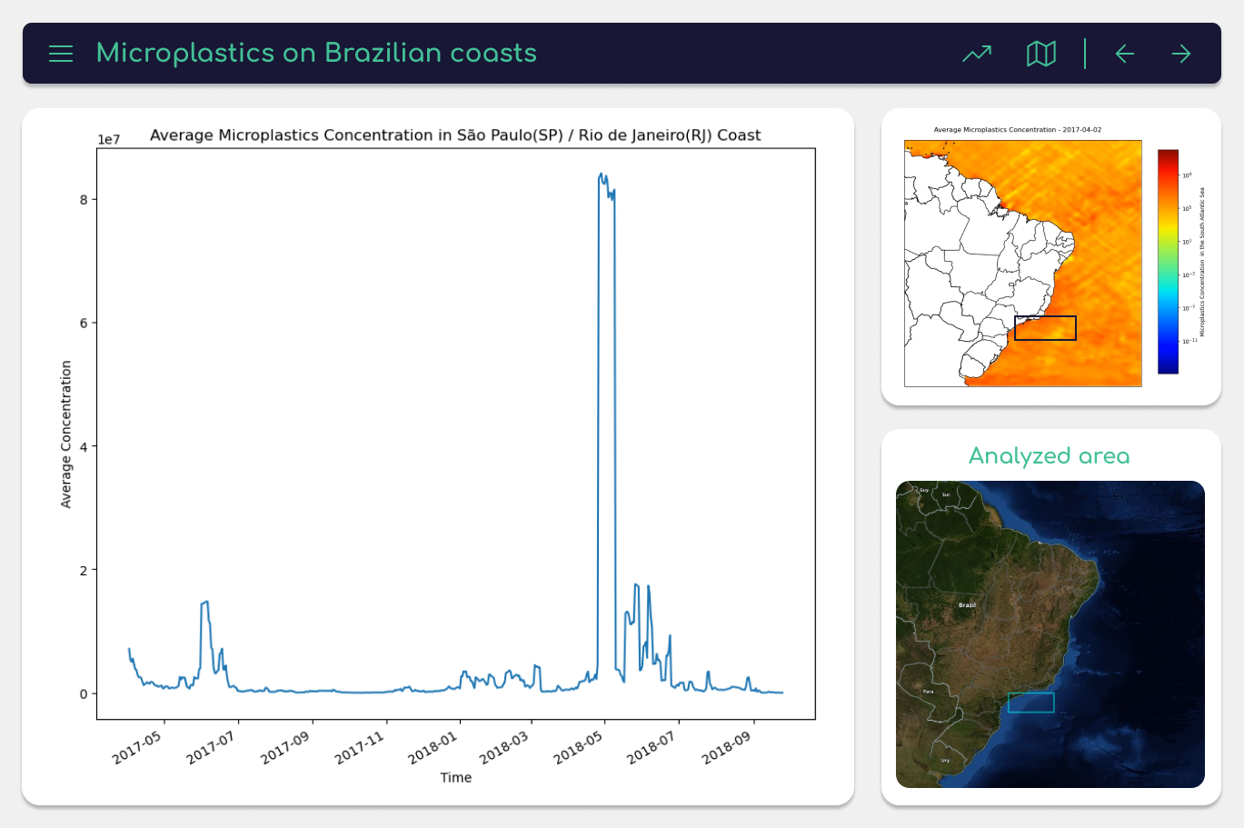
Project: Microplastics along the Brazilian Coast (SDG 6: Clean water and sanitation)
Team members

| Name | Username | Hometown | Social handle or URL |
| Kelly Ramos Pereira | wtkellyy | Porto Alegre - Rio Grande do Sul, Brazil | |
| Marília Rangel Fernandes | Marília | Parnamirim - Rio Grande do Norte, Brazil | |
| Ruan Vitor Cordeiro da Silva | ruvit | São Pedro - Rio Grande do Norte, Brazil | |
| Wesley Moreira Andrade | wesley_andradez | Guaratinga - Bahia, Brazil |
Background
Kelly is an animal rights advocate and runs a non-profit organization to rescue stray animals. She is currently taking a gap year and applying to universities in the USA. She also works as a project manager and UI/UX designer for an international company.
Marília enjoys writing poetry and getting outside to enjoy nature. She is currently in her third semester studying biology and education at the Federal University of Rio Grande do Norte (UFRN). She is also participanting in the Institutional Scholarship Program for Initiation to Teaching (PIBID).
Ruan graduated from the Federal Institute of Rio Grande do Norte, and is studying hard to become a data scientist or engineer at a big tech company. This year he plans to apply to universities in the USA to study computer science or data science.
Wesley is passionate about defending environmental causes. He graduated from a technical environmental course at the Federal Institute of Bahia (IFBA). He is currently taking a gap year to apply to universities in the USA to study biology, while also working as an elementary school English teacher.
What motivated you to choose this topic?
In July 2022, National Geographic Brazil reported, “In Brazil, 2.3 million tons of plastic are at a high risk of reaching the sea.” Our observation is focused on the coast of 8 states from different regions of Brazil where microplastic accumulation is most evident. These states also have in common the practice of consuming fish and other seafood, making the presence of microplastics a threat to human health.
The lived experiences shared by members of our team living in one of the areas affected (Rio Grande do Norte) provided a great start for us to understand the cultural aspects of the problem. According to IBGE (Brazilian Institute of Geography and Statistics), the state of Rio Grande do Norte produces 30% of all the shrimp in Brazil. This characteristic is so distinctive that the state's natives are called “potiguares”, which come from Tupi and means “shrimp eaters”.
Our study aims to assess the Brazilian coastline and identify the high-risk points of fish contamination for the population that relies on them as a food source. It is of utmost importance that the government has access to these data to formulate cleaning policies in these areas and properly alert the population.
What are some other things you tried that didn’t necessarily make it into the final workflow?
Another aspect we considered was researching the impacts of microplastics on Amazon rivers, which are affected by pollution originating from the seas.
Check out H2plastic's full write-up and solution in the competition repo.
Hunatek-Kalman
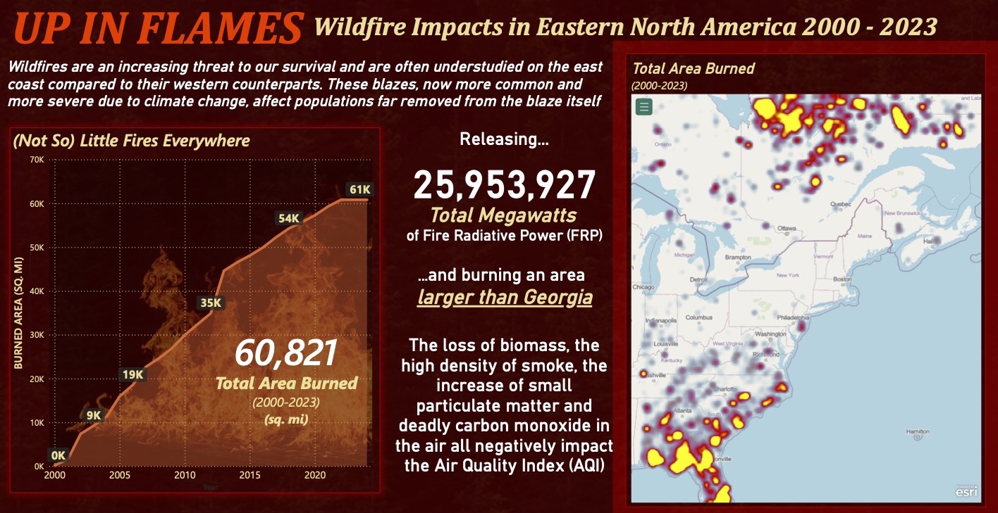
Project: Wildfire impacts in eastern North America (SDG 13: Climate Action)
Team members


| Name | Username | Hometown | Social handle or URL |
| Ben Walzer | bwalzer009 | Falls Church, Virginia, USA | |
| Meredith Flabiano | mnflabiano | Dallas, Texas, USA | |
| Nicholas Anderson | nanderson | Alexandria, Virginia, USA | |
| Rowan Mahajan | rowanam | Faifax, Virginia, USA |
Background
Ben is a Cost Analyst and Data Scientist at Kalman & Company, a Women-Owned Small Business that provides management consulting services to federal government entities. In his role, he supports federal acquisition programs develop cost and decision support analyses.
Meredith is a Cost and Data Analyst with the Business Analytics Team at HunaTek, an Alaskan Native Corporation that provides management consulting and logistics services to various federal agencies. She holds a Bachelor of Science in Astronomy-Physics from the University of Virginia, and a Master of Science in Marketing and Management from the McIntire School of Commerce at UVA.
Nicholas is a Cost Analyst with the Hunatek Professional Services Business Analytics Team, where he works on developing cost models and other analytical products. He holds a B.S. in Astronomy/Physics from the University of Virginia and an M.A. in Musicology from the Eastman School of Music.
Rowan is a Business Intelligence Analyst at HunaTek. She has a deep love for astronomy (especially rocket ships), and studied astronomy and biology at the University of Virginia. She later earned a Masters in Decision Analytics at Virginia Commonwealth University.
What motivated you to choose this topic?
Our team was initially drawn to the topic of wildfires by our recollection of Canada’s extreme 2023 fire season and the personal impact it had on all of us living in the Washington, DC area, in which we experienced several days of extremely poor air quality. We were motivated to combine satellite observations with air quality indices from monitors across the US to investigate the impacts that wildfires have in areas far removed from the fires themselves.
Perhaps unsurprisingly, most research and attention on US wildfires have focused on the western part of the country. We decided to create a wildfire data product centered around fire incidents and their effects on air quality in the Eastern US. We intended to expand upon the existing, Western-US-based discussions of fire management and to promote awareness of those discussions in regions less accustomed to handling fire disasters.
High level summary of your approach
Our visualization leverages data from the Environmental Protection Agency (EPA)’s Air Quality System (AQS) data repository, which aggregates air pollution data collected by the EPA and other agencies from monitors across the United States. Additionally, we pulled burned area data from the MODIS Terra and Aqua combined MCD64A1 Climate Modeling Grid Burned Area data product. Also from MODIS, we used the archive of MODIS C6.1 Active Fire data directly from the Fire Information for Resource Management System (FIRMS) website going back to 2000, collecting data for the entire United States and Canada.
We processed the air quality and the burned area data through Jupyter Notebook, using the osgeo/gdal, numpy, os, and pandas packages.
We chose Power BI to make our final product due to its capacity for presenting robust numerical visualizations together with text fields, allowing us to tell a powerful story with the data. Within Power BI, we made a simple relational data model from the datasets by linking them together along common coordinates.
Check out Hunatek-Kalman's full write-up and solution in the competition repo.
Spatial Clan
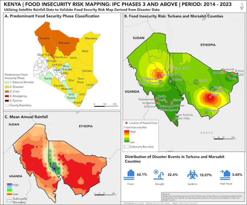
Project: Disaster-driven food insecurity risk mapping in Kenya (SDG 2: Zero Hunger)
Team members


| Name | Username | Hometown | Social handle or URL |
| Eileen Mburu | Insights101 | Nairobi, Kenya | |
| Linus Anari | linusanari_ | Kisii, Kenya |
Background
Eileen has a background in Geographic Information Systems (GIS), and is currently working to apply GIS methodologies to address climate change challenges, including mitigation, adaptation, and resilience efforts.
Linus is a geospatial engineering student at the University of Nairobi. He is passionate about leveraging spatial data for innovative solutions, with a focus on mapping, remote sensing, and geographic information systems (GIS). He aspires to contribute to sustainable development through the application of geospatial technology's insane potential!
What motivated you to choose this topic?
Our motivation was influenced by recent and prolonged floods in Northern Kenya attributed to El Niño rains during the Oct-Nov-Dec season. Preceding these floods, the region had endured prolonged drought.
While working with the Red Cross last year, one of our team members had a unique opportunity to interact directly with communities, especially in North Eastern Kenya and the Coastal region. The team member gained insights into local perspectives on weather patterns, which align with existing research indicating that these regions are prone to extreme weather events.
Engagement with the community revealed that, even as they anticipate El Niño, these regions are inevitably bound to return to drought conditions, creating a repetitive cycle. The firsthand experience of the community's challenges and their resilience inspired our interest in exploring how Geographic Information Systems (GIS) could provide insights into food security hotspots, facilitate targeted interventions, and minimize the impact of extreme weather events and disasters on food security in the region.
High level summary of your approach
Food and nutrition security assessment reports in Kenya, conducted by the Kenya Food Security Steering Group and made publicly available by the National Drought Management Authority (NDMA), evaluate various factors within each county to determine its current food security phase classification.
Disasters, known to jeopardize agricultural production and the livelihoods of millions reliant on agrifood systems, are seldom integrated into spatial analyses in food security assessments. We chose to incorporate disaster data to spatially disaggregate food security assessments in counties predominantly classified in Crisis stage 3, i.e., Turkana and Marsabit. We then validated these findings using satellite rainfall data, a crucial factor directly influencing food security.
Check out Spatial Clan's full write-up and solution in the competition repo.
Viva Aqua
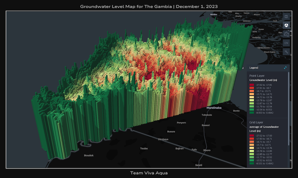
Project: Groundwater level map to suppot well-drilling in The Gambia (SDG 6: Clean Water and Sanitation)
Team members


| Name | Username | Hometown | Social handle or URL |
| Adam Zheng | AtomicTiger | East Amherst, New York, USA | |
| El Hadji Malick DIEYE | Jaay | Dakar, Senegal | |
| Francisco Furey | franfurey | Cordoba, Argentina | |
| Malena García Vildoza | Malenag | Buenos Aires, Argentina |
Background
Adam is studying aerospace engineering at Texas A&M University, with minors in mathematics and philosophy. He has experience leading student teams & organizations, and conducting research on topics including space robotics, optimizing fork biodegradability, web development, CAD, Arduino, and filmmaking.
El Hadji has an associate equivalent degree in Geomatics and a bachelor's degree equivalent in Land Surveying and Planning from the University of Thies/Senegal. He is currently interning as a GIS assistant at the Ecological Monitoring Center, and actively participates in the Senegalese Association of Geomaticians and the Eco-Citizen Association.
Francisco is a lover of programming, python, nature, satellite imagery and drone piloting. He is a YLAI and Global Shapers fellow. He is from Argentina, but currently works for a US-based startup related to the NFL as a data scientist. He previously co-founded a social e-commerce site in Argentina. His dream is to work at or found a climatetech startup.
Malena is a student in Social and Cultural Anthropology at the Universidad Nacional de San Martín - EIDAES. For her undergraduate thesis, she conducted research on the activism of an organization of young immigrants in the city of Buenos Aires. She is interested in research that integrates tools from different sciences to contribute to social and environmental justice, as well as the well-being of marginalized communities.
What motivated you to choose this topic?
The idea for this project originated from a volunteering trip that one of our team members made to Honduras to design a pipe system for delivering clean water to a rural community. There were many hand-dug wells that suffered from contamination and water borne illnesses, so a nonprofit came in, conducted a hydrogeological survey, and drilled a borehole well to provide uncontaminated groundwater.
We wanted to reduce the costs associated with hydrogeological surveying by using machine learning and satellite/climatic data to create an open-source tool that can map out key information such as groundwater level data.
How did you engage with the broader context of your chosen issue?
To gain deeper insights on Gambia, we got in contact with The Association of Non-Governmental Organizations in the Gambia (TANGO), an umbrella organization founded in 1983 to coordinate NGOs operating in the country. TANGO connected us with various community leaders who were actively involved in similar issues, and we had the opportunity to interview some of them.
After engaging with representatives from the community, we are confident that the implementation of additional groundwater wells would very much have a net positive impact on the daily lives of the people. If our project is implemented, it would be crucial to collaborate with various key actors and institutions within Gambia to prevent inequitable distribution of these resources.
Check out Viva Aqua's full write-up and solution in the competition repo.
Thanks to all the challenge participants and to our winners! And thank you to NASA, the U.S. Mission to International Organizations in Vienna, and the UN Office for Outer Space Affairs for making this challenge possible.